
Meyers
Illustration System for a Culinary Universe
Client
Meyers
Industry
Food Services & Hospitality
Services
Illustration
Design systems
A fresh layer of personality for Meyers.
As part of a larger digital rebrand led by Dwarf, we developed a new illustration system designed to complement and extend Meyers’ visual identity. The ambition was to create a flexible and cohesive visual language that reflects the brand’s core elements, while introducing a more human and approachable dimension.
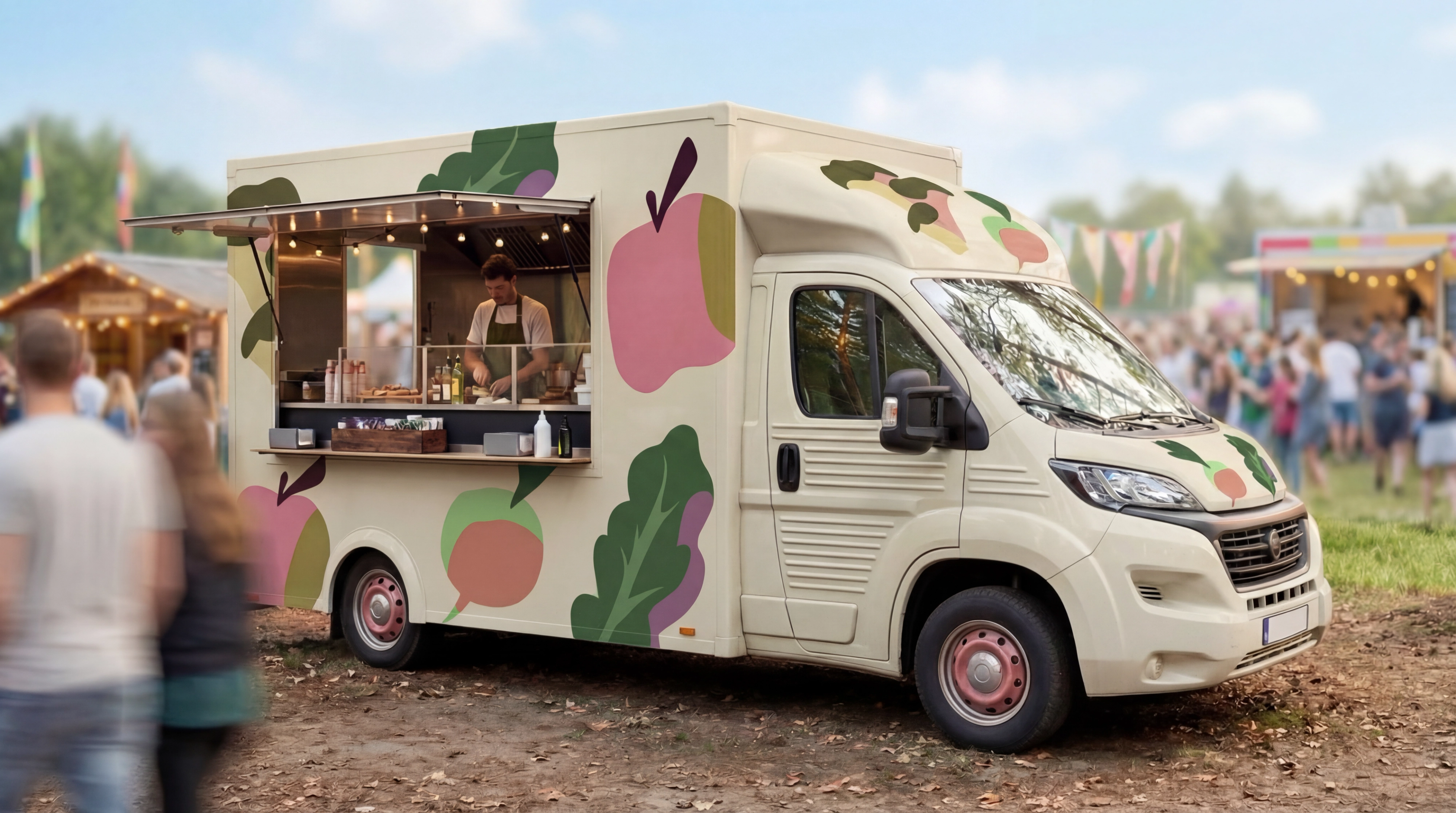
Built for adaptability across platforms, the system draws on bold contrasts, confident shapes and a warm tone of voice. From small icons to larger graphic elements, the illustrations are designed to stay clear, playful and full of character - adding both consistency and life to the digital experience.
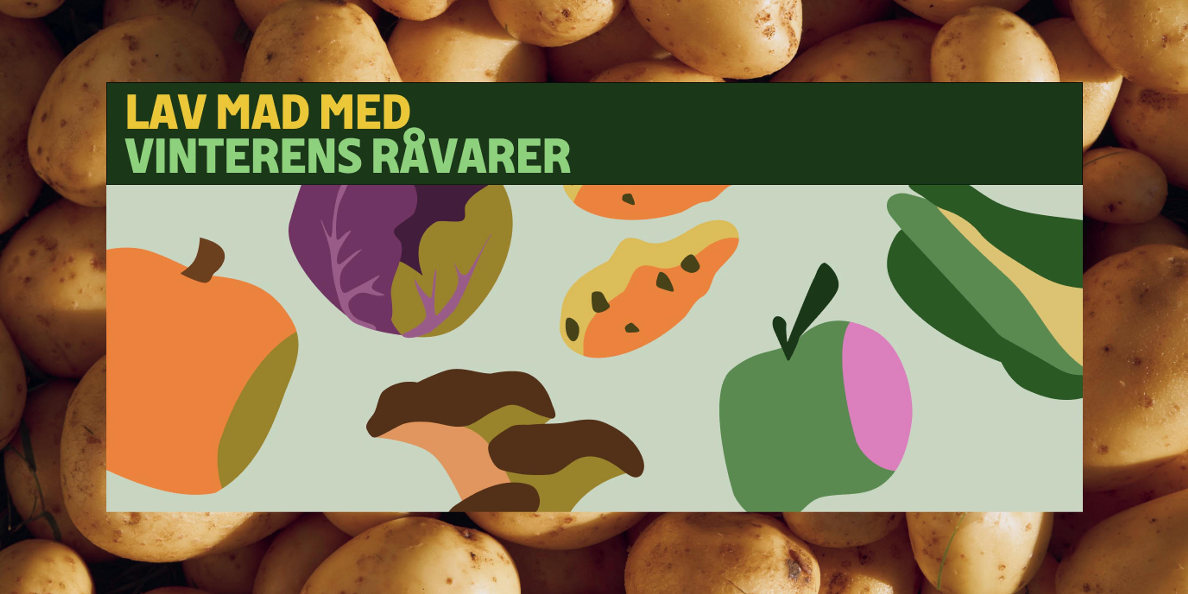
An illustration system with playful, organic flexibility
The illustration system was developed to reflect Meyers’ love of food, ingredients and the sensory experience of cooking, while adding a warm and playful dimension to the visual identity. Inspired by organic ingredients and the imperfect beauty of raw produce, the shapes and lines carry a slightly uneven, hand-crafted quality that helps the system feel lively, human and full of character.
To make the style both distinctive and scalable, we built it around a simple visual principle: each illustration is composed from three core elements; a main shape, a detail shape and a contrasting colour shadow shape. This creates a clear and recognisable structure that gives the illustrations consistency, while still leaving room for variety and personality.
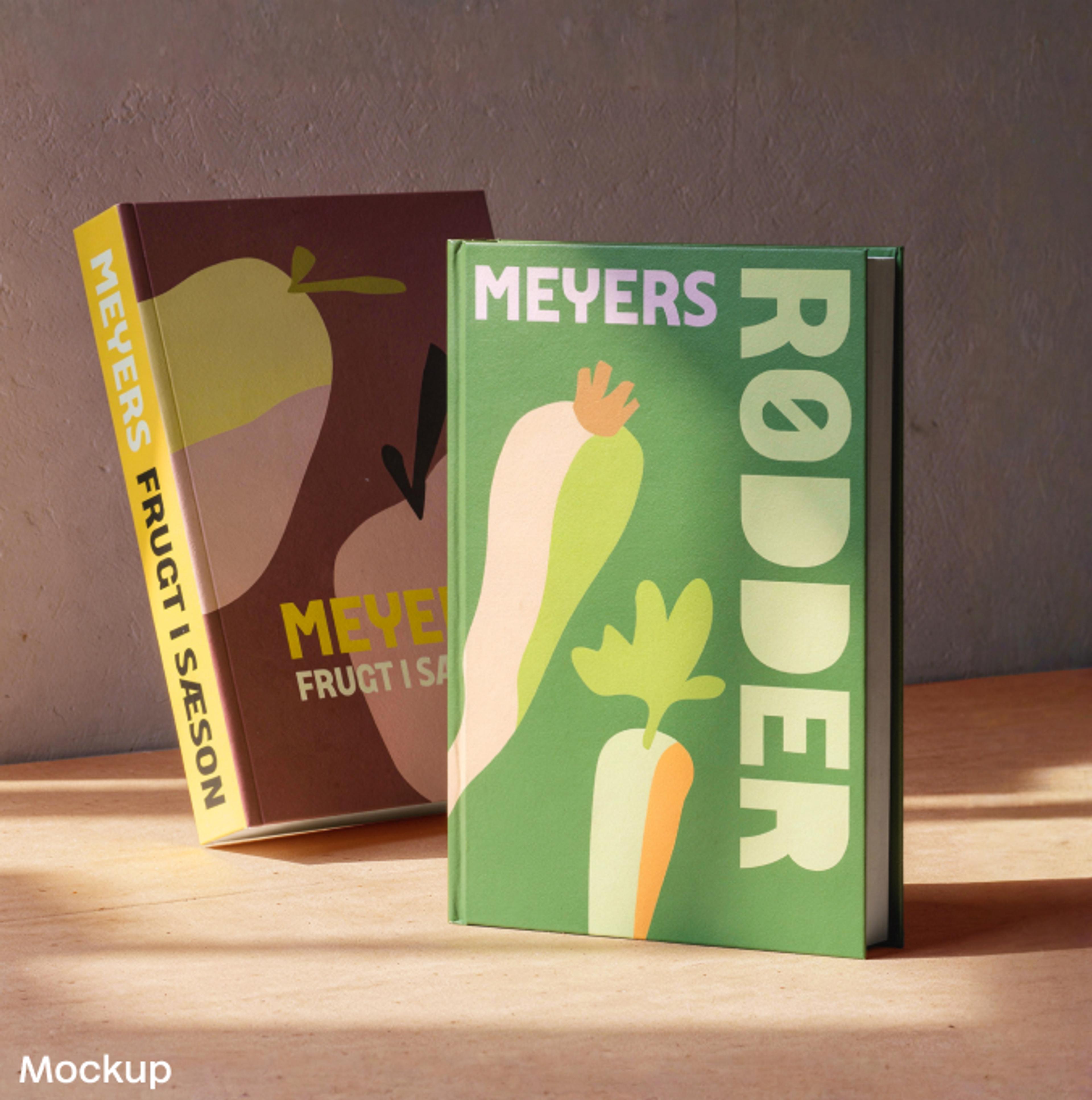
The result is a flexible system that can be used to create a wide range of elements across formats and touchpoints. From small icons to larger graphic compositions, the illustrations maintain a bold, friendly and approachable look.


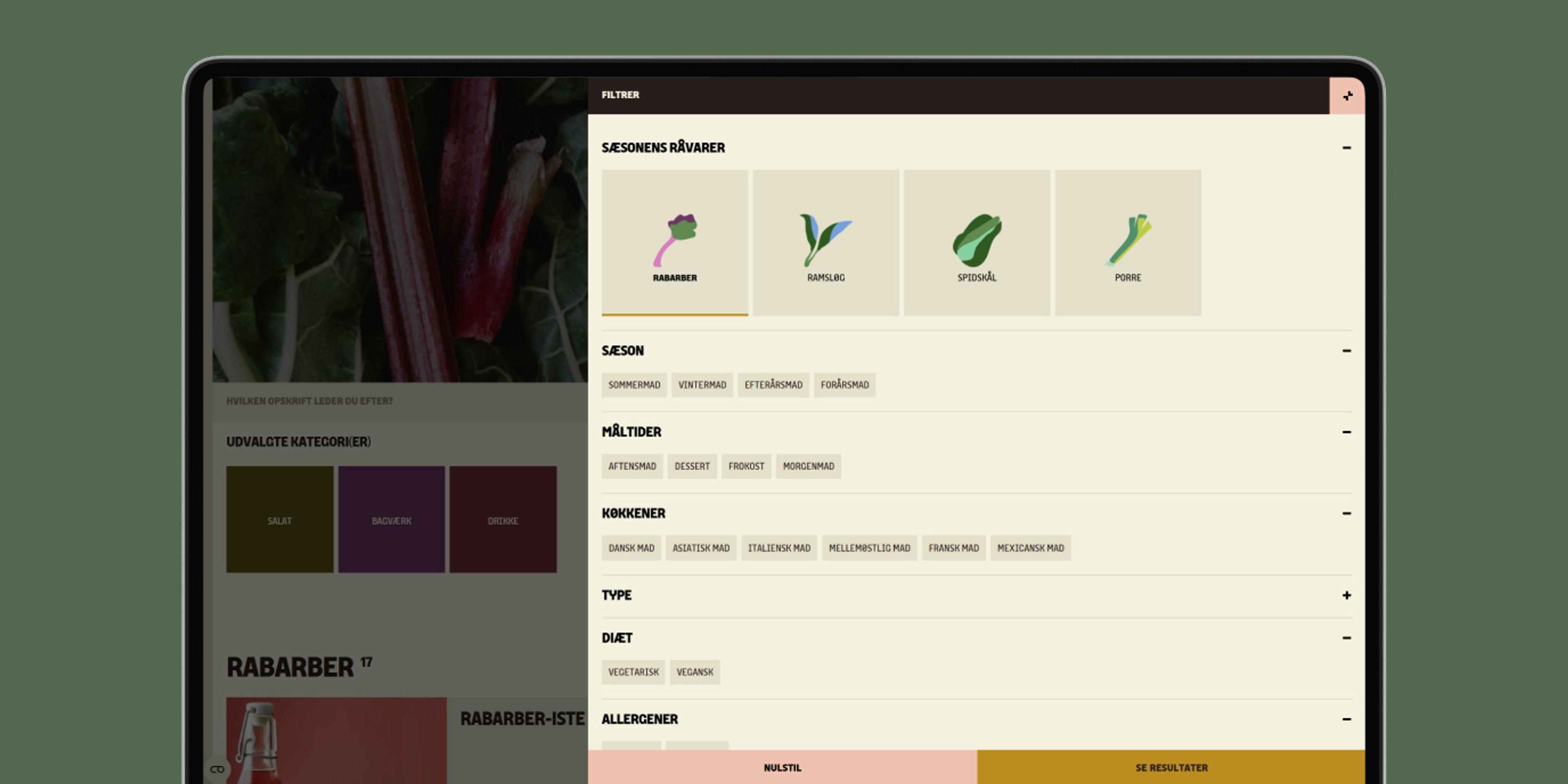
Flexible colour themes across the system
To support the illustration system, we developed six distinct colour themes aligned with the UI design of Meyers’ new website. Each theme is carefully composed to fit naturally within the digital experience, while giving the illustrations their own presence and clarity.
The palette is designed to create variation without losing cohesion. By combining colours in different ways across themes, the system stays flexible and dynamic — allowing the illustrations to shift in tone and mood while still feeling unmistakably Meyers.
Elizabeth Björkqvist
Product Owner & Digital Performance Lead, Meyers
“The illustrations have made our brand more vibrant and given it a character that feels like a natural extension of the universe we have already built. It has been a collaboration where we have felt understood, both in terms of our professional expertise and in the way we want to present ourselves visually. We are very pleased with the result.”

Credits
Made in collaboration with
Creative Director
Esben Fisker
Project Lead & Art Direction
Emilie Noer Bobek
Illustration
Emilie Noer Bobek
Hannah Genzmer
Curious to learn more? Get in touch.