
Augustinus Fonden
A Tactile Illustration Language
Client
Augustinus Fonden
Industry
Foundation
Services
Illustration
Augustinus Fonden supports Danish cultural and artistic life. That context mattered. A foundation with that kind of identity doesn't need illustration to decorate its website; it needs illustration that reflects what it stands for. The brief, developed together with digital agency Dwarf, was to create a visual layer that felt considered and human without overshadowing the content it sat alongside.
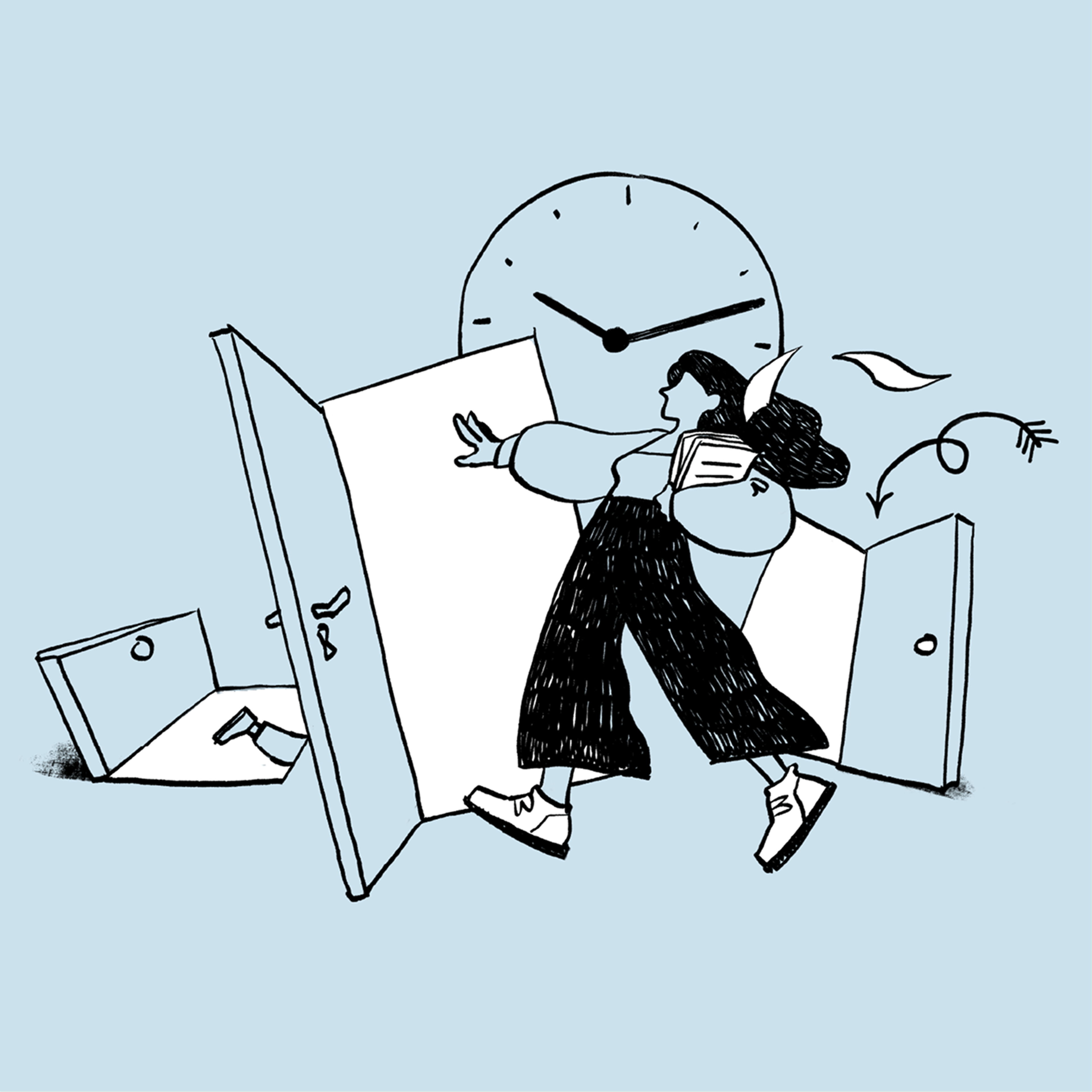
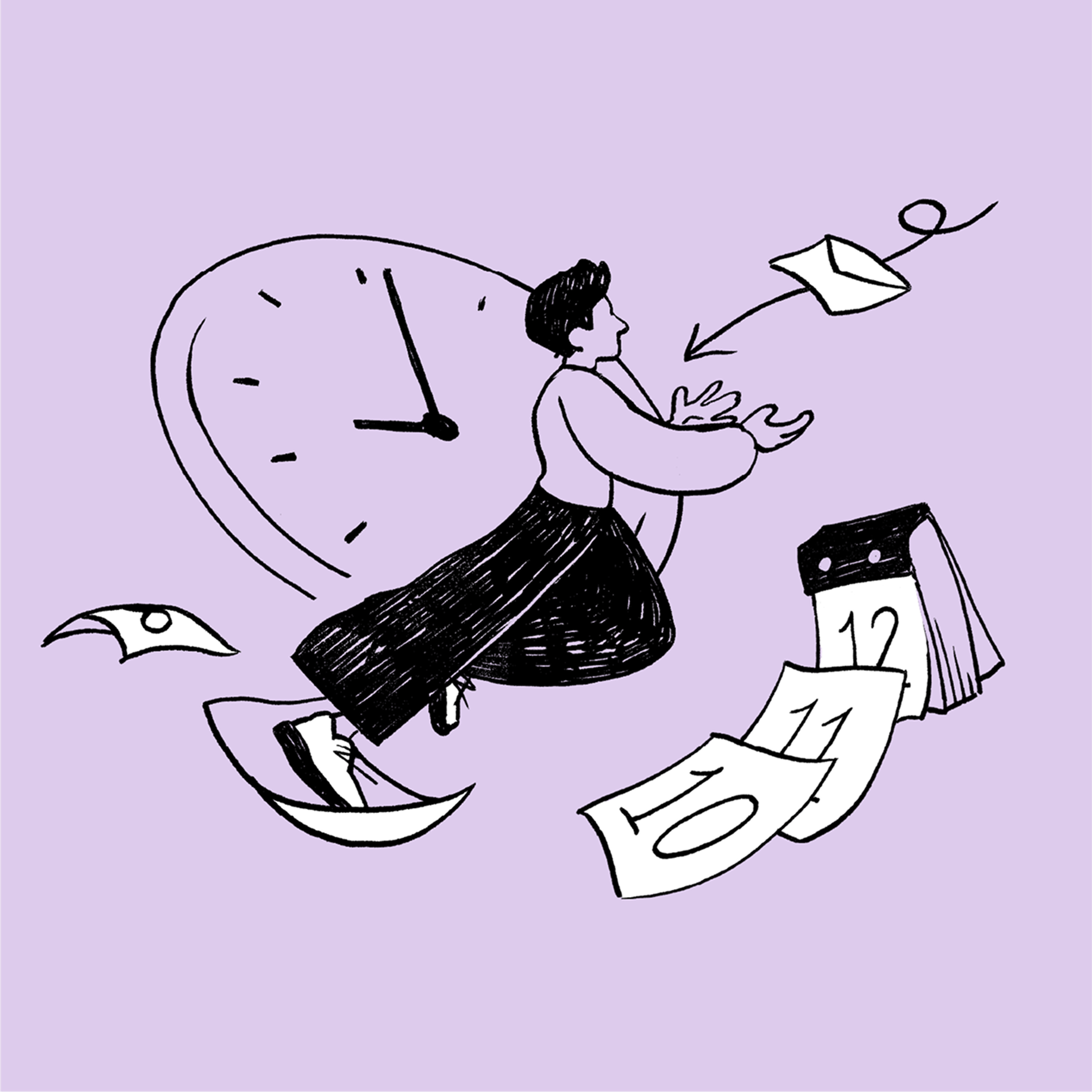
The answer was an analogue-inspired aesthetic. Subtle texture, quiet depth, a tactile quality that brings warmth to a clean and minimal digital experience. Not illustration as spectacle, but illustration as atmosphere. Something that makes the site feel like it was made with the same care the foundation brings to the work it supports.
A system of quiet companions
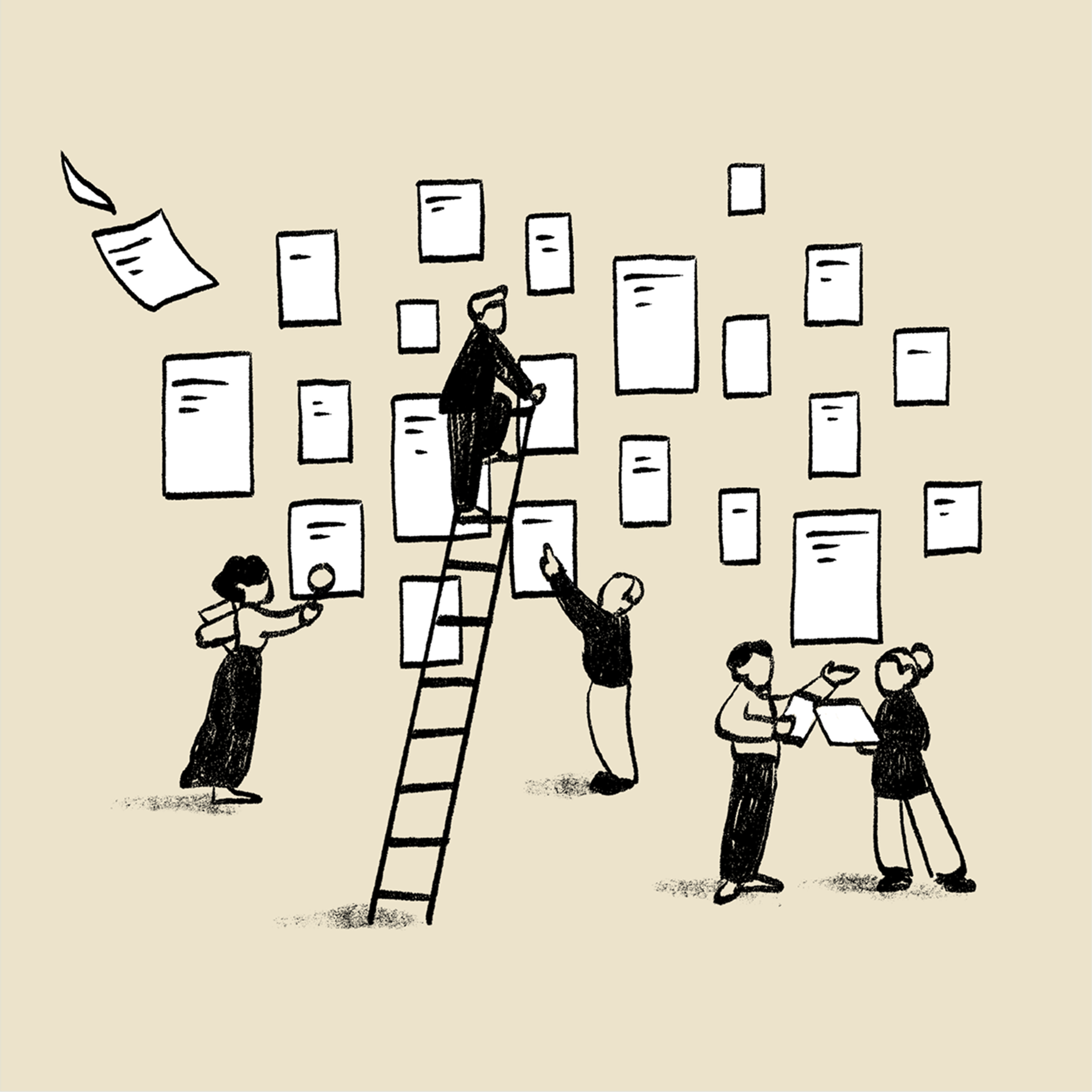
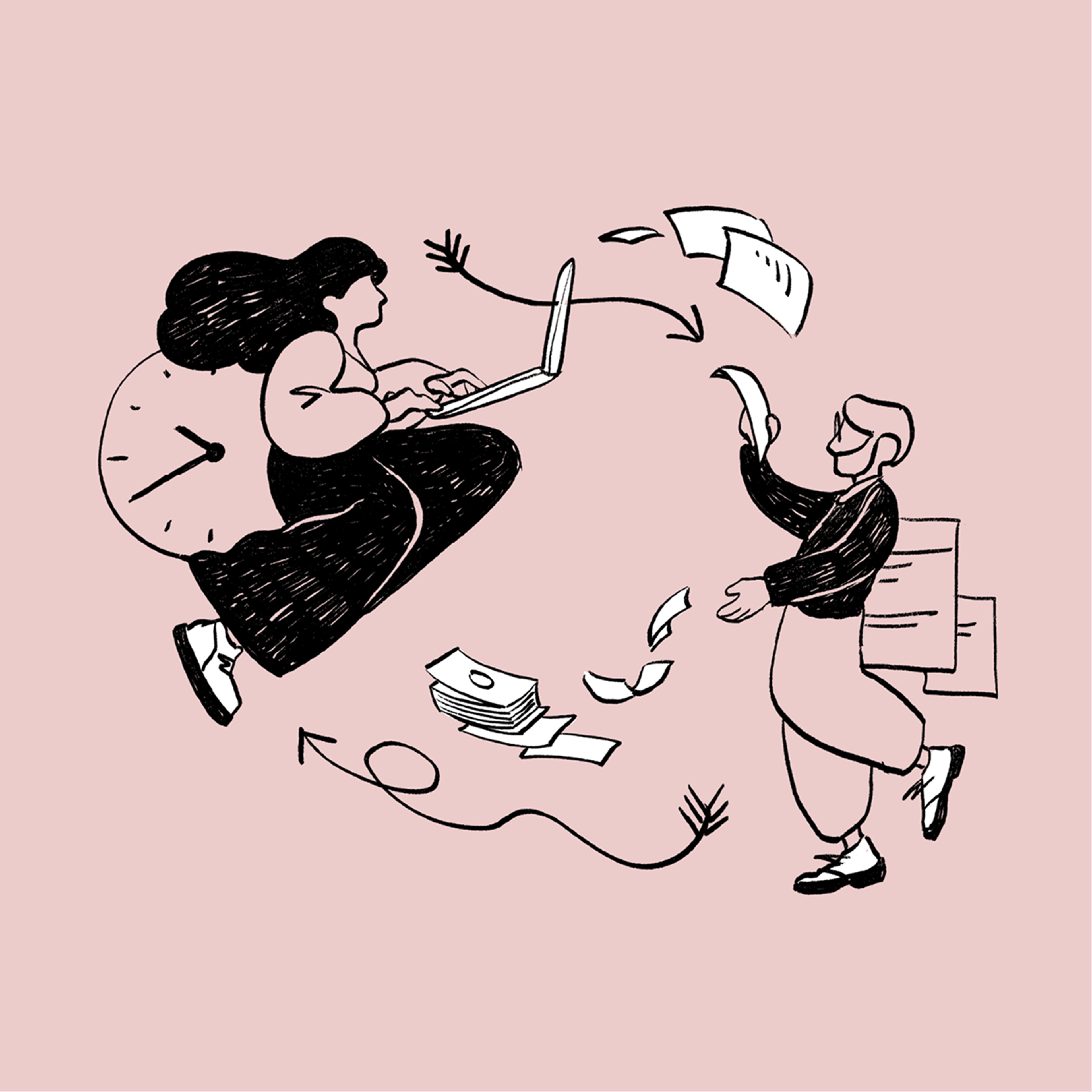
The illustrations were never meant to lead. They work alongside content, guiding the eye, creating moments of visual interest, giving the site a sense of craft without demanding attention. Each piece was designed to function within the grid while feeling like it existed beyond it.
That balance required a consistent visual logic across the full set. The analogue texture and restrained palette do the work of unification, leaving room for each illustration to have its own character within the system. The result is a coherent visual layer that moves through the site without repeating itself.
Credits
Art Director
Esben Fisker
Illustrator
Camilla Woldby
Curious to learn more? Get in touch.